Plotting and Visualization
matplotlib 패키지를 사용하기위 해서는 다음과 같이 한다.
In [11]:
%matplotlib inline
# %matplotlib notebook
A Brief matplotlib API Primer
matplotlib 패키지는 다음과 같이 사용한다.
In [12]:
import matplotlib.pyplot as plt
import numpy as np
In [13]:
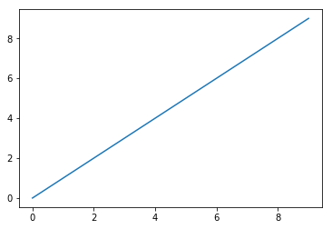
data = np.arange(10)
plt.plot(data)
Out[13]:
[<matplotlib.lines.Line2D at 0x2801c00aa90>]
Figures and Subplots
matplotlib 그림은 Figure 객체 속에 있다. plt.figure를
이용해 새로운 그림 객체를 생성할 수 있다.
In [14]:
fig = plt.figure()
<matplotlib.figure.Figure at 0x2801c030438>
In [15]:
ax1 = fig.add_subplot(2, 2, 1)
In [16]:
ax2 = fig.add_subplot(2, 2, 2)
ax3 = fig.add_subplot(2, 2, 3)
In [17]:
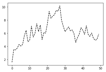
plt.plot(np.random.randn(50).cumsum(), 'k--')
Out[17]:
[<matplotlib.lines.Line2D at 0x2801c81bcc0>]
In [18]:
ax1.hist(np.random.randn(100), bins=20, color='k', alpha=0.3)
Out[18]:
(array([ 2.,  0.,  1.,  2.,  3.,  5.,  6.,  9.,  5.,  5., 10., 12.,  7.,
         8., 12.,  1.,  6.,  2.,  2.,  2.]),
 array([-2.93205997, -2.67103158, -2.41000319, -2.1489748 , -1.88794641,
        -1.62691802, -1.36588963, -1.10486124, -0.84383285, -0.58280445,
        -0.32177606, -0.06074767,  0.20028072,  0.46130911,  0.7223375 ,
         0.98336589,  1.24439428,  1.50542267,  1.76645106,  2.02747945,
         2.28850785]),
 <a list of 20 Patch objects>)
In [19]:
ax2.scatter(np.arange(30), np.arange(30) + 3 * np.random.randn(30))
Out[19]:
<matplotlib.collections.PathCollection at 0x2801c84f978>
plt.subplots 메소드를 통해서 여러 개의 부분 플롯들을 그릴 수 있다.
In [20]:
fig, axes = plt.subplots(2, 3)
axes
Out[20]:
array([[<matplotlib.axes._subplots.AxesSubplot object at 0x000002801E7010F0>,
        <matplotlib.axes._subplots.AxesSubplot object at 0x000002801E722C18>,
        <matplotlib.axes._subplots.AxesSubplot object at 0x000002801E748C50>],
       [<matplotlib.axes._subplots.AxesSubplot object at 0x000002801E760C50>,
        <matplotlib.axes._subplots.AxesSubplot object at 0x000002801E72E278>,
        <matplotlib.axes._subplots.AxesSubplot object at 0x000002801E7D34A8>]],
      dtype=object)
axes 배열을 이용해서 각각의 그림을 그릴 수 있다.
In [21]:
axes[0, 1].plot(np.random.randn(30))
Out[21]:
[<matplotlib.lines.Line2D at 0x2801f806fd0>]
sharex=True, sharey=True 인자를 이용해서 모든 그림들이 같은 축을
같도록 할 수 있다. matplotlib에 대한 더 자세한 사용법은
홈페이지를 참조한다.
다음은 `pyplot.subplots`의 선택 인자들이다.
| Argument | Description |
|---|---|
| nrows | Number of rows of subplots |
| ncols | Number of columns of subplots |
| sharex | All subplots should use the same x-axis ticks (adjusting the xlim will affect all subplots) |
| sharey | All subplots should use the same y-axis ticks (adjusting the ylim will affect all subplots) |
| subplot_kw | Dict of keywords passed to add_subplot call used to create each subplot |
| **fig_kw | Additional keywords to subplots are used when creating the figure, such as plt.subplots(2, 2, figsize=(8, 6)) |
Adjusting the spacing around subplots
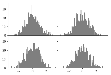
기본적으로 subplots은 그림들 간의 간격(spacing)과 각 그림 내에서 내부
간격(padding)이 존재한다. Figure 객체의 메소드를 이용해서 조정할 수
있다.
subplots_adjust(left=None, bottom=None, right=None, top=None, wspace=None, hspace=None)
wspace와 hspace는 그림 객체의 너비와 높이에 대한 상대적인
백분율로 표현된다. 다음은 그림간의 간격을 없앤 예이다.
In [22]:
fig, axes = plt.subplots(2, 2, sharex=True, sharey=True)
for i in range(2):
    for j in range(2):
        axes[i, j].hist(np.random.randn(500), bins=50, color='k', alpha=0.5)

fig.subplots_adjust(wspace=0, hspace=0)
Colors, Markers, and Line Styles
matplotlib
plot
함수는 x, y 데이터와 선택적으로 선 색깔와 선 모양에 대한 문자열을 지정할
수 있다. 예를 들면 x, y 자료에 초록색 대시(dash) 선은 다음과
같이 사용한다.
ax.plot(x, y, 'g--')
다음과 같이 하나 하나 구체적으로 나열해도 된다. 웹문서 linestyle과 color를 참조하자.
ax.plot(x, y, color='g', linestyle='--')
마커(marker)를 이용해서 점을 다르게 표시할 수 있다.
In [23]:
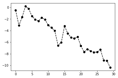
plt.plot(np.random.randn(30).cumsum(), 'ko--')
Out[23]:
[<matplotlib.lines.Line2D at 0x2801fb31278>]
또는 다음과 같이 하나 하나 성질을 나열해도 된다.
plt.plot(randn(30).cumsum(), color='k', linestyle='dashed', marker='o')
색깔을 지정할 때 color='xkcd:brownish yellow'와 같이
xkcd 색상을 사용할 수 있다. 연속
점들을 연결할 때 선형으로 연결하지 않고
`drawstyle= <https://matplotlib.org/api/_as_gen/matplotlib.lines.Line2D.html#matplotlib.lines.Line2D.set_drawstyle>`__
인자를 이용해 설정할 수 있다. 더 자세한 선택 인자들은
Line2D
선택인자를 참고하면 된다.
In [24]:
data = np.random.randn(30).cumsum()
In [29]:
plt.plot(data, 'k--', label='Default')
plt.plot(data, 'k-', drawstyle='steps-post', label='Steps-post')
plt.legend(loc='best')
Out[29]:
<matplotlib.legend.Legend at 0x2801fd0bb70>
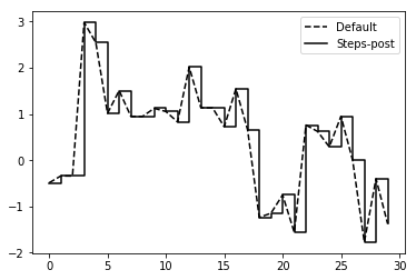
<matplotlib.legend.Legend at 0x...>가 출력되는 것은 plot,
legend 등이 추가되면서 각 컴포넌트 객체를 반환하기 때문이다. 보이지
않게 하려면 세미콜론 ;을 붙인다.
Ticks, Labels, and Legends
plot의 장식을 변경하는 방법은 크게 두 가지가 있다. 하나는
matplotlib.pyplot 모듈 함수들을 이용하는 방법과 또 다른 방법은 객체 지향
matplotlib API를 이용하는 것이다. 앞으로는 객체 지향 방법을 이용하도록
하겠다. 객체 지향 방법은 주로
`matplotlib.axes.Axes <https://matplotlib.org/api/axes_api.html#matplotlib.axes.Axes>`__
클래스를 이용하는 것이다. Figure 객체를 생성한 후 여기로부터
축들(Axes)을 추가하여 축들 객체를 이용하여 그림을 그린다.
matplotlib.pyplot의 figure 함수를 이용해서 새로운 Figure
객체를 생성한다.
import matplotlib.pyplot as plt

fig = plt.figure()
Figure 객체의 add_subplot 메소드를 이용해서 격자 형식의 축들을
만들고 원하는 축을 지정한다.
ax1 = fig.add_subplot(2, 1, 1)
add_subplot(2, 1, 1)은 첫번째 두 인자는 2행 1열의 격자를 만들라는
뜻이고 마지막 인자 1은 그 두 개의 격자 셀 중에서 처음에 있는 셀 즉, 왼쪽
셀을 차지한다는 뜻이다. add_subplot 은 축들(Axes) 객체를 반환한다.
축들 객체가 플롯에 필요한 모든 기능들을 포함하고 있다. 예를 들면
plot(), text(), hist(), imshow()등이 있다.
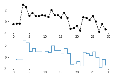
ax1.plot(data, 'ko--')
plt.show() 메소드를 이용해서 그림을 볼 수 있다. 주피터 노트북이나
Ipython 쉘에서는 매직 명령어 %matplotlib inline 또는 %matplotlib
가 show() 호출없이도 자동으로 그림을 보여준다.
plt.show()
2번째 셀에 그림을 그리고 싶으면 다음과 같이 새로운 축을 만들고 플롯을
실행하고 show() 함수를 호출하면 된다. show() 함수는 Figure
객체 설정을 마친 후 마지막에 실행해야 그림이 보인다.
ax2 = fig.add_subplot(2, 1, 2)
ax2.plot(data, drawstyle='steps-post')
plt.show()
In [47]:
import matplotlib.pyplot as plt

fig = plt.figure()
ax1 = fig.add_subplot(2, 1, 1)
ax1.plot(data, 'ko--')
# plt.show()
ax2 = fig.add_subplot(2, 1, 2)
ax2.plot(data, drawstyle='steps-post')
plt.show()
Setting the title, axis labels, ticks, and ticklabels
다음은 Figure의
개념 그림이다.
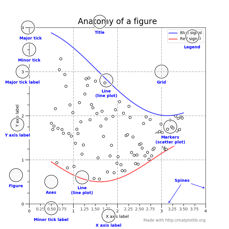
틱(tick)은 x와 y 틱이 있고 눈금의 위치를 표시하는 것이다.
틱라벨(ticklabel)은 틱 위치에 대응되는 문자열을 의미한다. 틱 위치와
틱라벨을 변경하려면 set_xticks와 set_xticklabels 메소드를
사용한다.
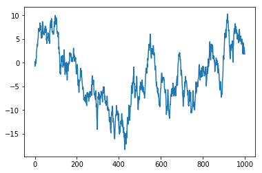
In [51]:
data = np.random.randn(1000).cumsum()
In [52]:
fig = plt.figure()
ax = fig.add_subplot(111)
ax.plot(data)
Out[52]:
[<matplotlib.lines.Line2D at 0x28024bb1710>]
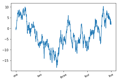
rotation=은 라벨을 회전시킨다.
In [68]:
fig = plt.figure()
ax = fig.add_subplot(111)
ax.set_xticks([0, 250, 500, 750, 1000])
ax.set_xticklabels(['one', 'two', 'three', 'four', 'five'], rotation=30, fontsize='small')
ax.plot(data)
Out[68]:
[<matplotlib.lines.Line2D at 0x28025eb9a90>]
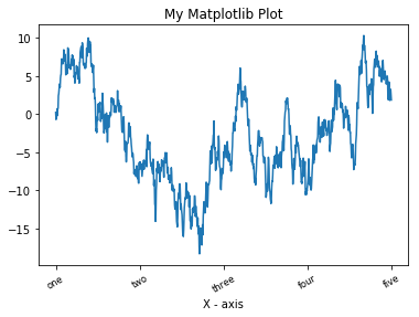
set_xlabel은 x축 라벨을 set_title은 제목을 설정한다.
In [69]:
fig = plt.figure()
ax = fig.add_subplot(111)
ax.set_xticks([0, 250, 500, 750, 1000])
ax.set_xticklabels(['one', 'two', 'three', 'four', 'five'], rotation=30, fontsize='small')
ax.set_xlabel('X - axis')
ax.set_title('My Matplotlib Plot')
ax.plot(data)
Out[69]:
[<matplotlib.lines.Line2D at 0x28025ee8908>]
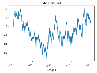
Axes 클래스는 set 메소드를 이용해서 성질들을 한꺼번에 설정할 수
있다.
In [81]:
props = {
    'title': 'My First Plot',
    'xlabel': 'Stages',
    'xticks': [0, 250, 500, 750, 1000]
}
horizontalalignment를 이용해 틱라벨의 위치를 설정한다.
In [83]:
fig = plt.figure()
ax = fig.add_subplot(111)
ax.set_xticklabels(['one', 'two', 'three', 'four', 'five'], rotation=30, fontsize='small', ha='right')

ax.set(**props)
ax.plot(data)
Out[83]:
[<matplotlib.lines.Line2D at 0x280260ee860>]
범례 달기
범례는 플롯의 중요한 항목 중 하나이다. 범례를 다는 방법은 여러 가지가
있지만 쉽게 접근할 수 있는 것은 plot 함수의 인자로 label=을
추가하는 것이다. 플롯을 한 후 legend 메소드를 실행하면 된다.
In [5]:
fig = plt.figure()
ax = fig.add_subplot(111)
ax.plot(np.random.randn(1000).cumsum(), 'k', label='one')
ax.plot(np.random.randn(1000).cumsum(), 'k--', label='two')
ax.plot(np.random.randn(1000).cumsum(), 'k.', label='three')

ax.legend()
Out[5]:
<matplotlib.legend.Legend at 0x25c31bb06a0>
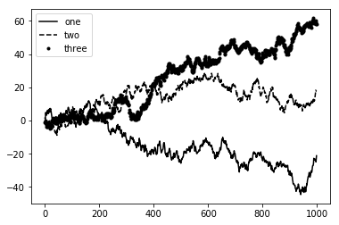
legend 메소드는 범례를 다는 위치를 선택할 수 있는 loc 선택인자가
있다. 자세한 것은 ax.legend?를 실행해 도움말을 살펴보자.
어노테이션 및 도형
표준 플롯 외에 자신만의 텍스트, 화살표, 모양 등을 추가할 수 있는
어노테이션 기능이 있다. 어노테이션은 text, arrow, annotate
메소드들을 이용할 수 있다. text는 지정된 x, y 좌표에
스타일 선택 인자를 이용해 맞춤화할 수 있다.
ax.text(x, y, 'Hello world', family='monospace', fontsize=10)
S&P 500 인덱스 가격의 예를 들어보자. 다음은 2008 - 2009년 동안의 경제 위기에 대한 어노테이션 예이다.
In [7]:
from datetime import datetime

data = pd.read_csv('data/spx.csv', index_col=0, parse_dates=True)
spx = data['SPX']
spx.head()
Out[7]:
1990-02-01    328.79
1990-02-02    330.92
1990-02-05    331.85
1990-02-06    329.66
1990-02-07    333.75
Name: SPX, dtype: float64
In [8]:
fig = plt.figure()
ax = fig.add_subplot(1, 1, 1)

spx.plot(ax=ax, style='k-')

crisis_data = [
    (datetime(2007, 10, 11), 'Peak of bull market'),
    (datetime(2008, 3, 12), 'Bear sterns fails'),
    (datetime(2008, 9, 15), 'Lehman bankruptcy')
]

for date, label in crisis_data:
    ax.annotate(label,
                xy=(date, spx.asof(date) + 75),
                xytext=(date, spx.asof(date) + 225),
                arrowprops=dict(facecolor='black', headwidth=4, headlength=4, width=2),
                horizontalalignment='left',
                verticalalignment='top'
               )

ax.set_xlim(['1/1/2007', '1/1/2011'])
ax.set_ylim([600, 1800])
ax.set_title('Import date in the 2008-2009 financial crisis')
Out[8]:
Text(0.5,1,'Import date in the 2008-2009 financial crisis')
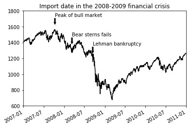
annotate 메소드의 xy는 어노테이트 될 좌표이고 xytext는
문자가 위치할 좌표로 순서쌍으로 지정한다. 보는 바와 같이 xytext
위치에서 xy 위치로 화살표가 그려진다. arrowprops는 화살표
모양을 설정한다. 자세한 것은 어노테이션
웹페이지를
참조하자.
asof(date)는 주어진 날짜 date 보다 작거나 같은 날짜의 인덱스중
가장 최근의 날짜에 해당하는 값을 반환한다. 따라서 시리즈의 인덱스는 날짜
인덱스여야 한다.
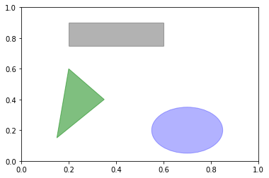
도형을 그리기 위해서는 matplotlib.patches를 이용한다. 패치
예제
웹페이지를 확인하자.
In [9]:
import matplotlib.patches as pch

fig = plt.figure()
ax = fig.add_subplot(1, 1, 1)

circ = pch.Circle((0.7, 0.2), radius=0.15, color='b', alpha=0.3)
rect = pch.Rectangle((0.2, 0.75), width=0.4, height=0.15, color='k', alpha=0.3)
pgon = pch.Polygon([[0.15, 0.15], [0.35, 0.4], [0.2, 0.6]], color='g', alpha=0.5)

ax.add_patch(circ)
ax.add_patch(rect)
ax.add_patch(pgon)
Out[9]:
<matplotlib.patches.Polygon at 0x25c35e65b38>
파일로 저장하기
플롯을 파일로 저장하기 위해서는 plt.savefig 함수를 이용한다. 이
함수는 Figure 객체의 savefig 메소드와 같은 것이다. svg
형식으로 저장하기 위해서는 다음과 같이 하면 된다.
plt.savefig('figpath.svg')
파일 형식은 확장자로부터 추정을 한다. 따라서 .pdf를 사용했다면
pdf 형식으로 저장이 된다. 출판을 위해 고려해야 할 사항으로
dpi와 bbox_inches가 있다. dpi는 인치당 점의 갯수를
의미하고 bbox_inches는 그림 주위의 여백을 조절할 수 있다.
plt.savefig('figpath.png', dpi=400, bbox_inches='tight')
savefig는 파일로 저장하는 것뿐 아니라 BytesIO와 같은
스트림으로 보낼 수도 있다.
from io import BytesIO

buffer = BytesIO()

plt.savefig(buffer)
plot_data = buffer.getvalue()
다음은 `savefig`의 선택인자들이다.
| Argument | Description |
|---|---|
| fname | String containing a filepath or a Python file-like object. The figure format is inferred from the file extension (e.g., .pdf for PDF or .png for PNG) |
| dpi | The figure resolution in dots per inch; defaults to 100 out of the box but can be configured |
| facecolor, edgecolor | The color of the figure background outside of the subplots; ‘w’ (white), by default |
| format | The explicit file format to use (‘png’, ‘pdf’, ‘svg’, ‘ps’, ‘eps’, …) |
| bbox_inches | The portion of the figure to save; if ‘tight’ is passed, will attempt to trim the empty space around the figure |
matplotlib 설정
matplotlib를 구성하는 그림 크기, 부분 플롯의 여백, 색, 글자 크기, 그리드
스타일 등 방대한 매개변수들은 거의 사용자가 변경가능하다. 프로그램
중에서 변경하는 방법으로는 rc 메소드를 이용하는 것이다. 예를 들어
그림의 크기를 10 x 10으로 전역으로 설정하려면 다음과 같이 한다.
plt.rc('figure', figsize=(10, 10))
rc의 첫번째 인자는 figure, axes, xtick, ytick,
grid, legend와 같이 변경하고자 하는 컴포넌트를 적는다. 다음
인자로는 변경하고자 하는 매개변수들을 키워드인자 형식으로 입력하면 된다.
쉬운 방법으로는 사전형식을 이용하는 것이다.
font_options = {'family': 'monospace',
                'weight': 'bold',
                'size': 'small'
                }

plt.rc('font', **font_options)
자세한 사용자 정의에 대해서 알려면 matplotlib/mpl-data 폴더 안에
matplotlibrc 파일을 참고 하면 된다. 이 파일의 내용을 수정해서 자신의
홈 디렉토리에 .matplotlibrc로 저장하면 matplotlib가 로드될
때 자동적으로 읽는다.
판다스와 seaborn을 이용한 플롯
matplotlib는 상당히 낮은 수준의 도구들을 제공한다. 데이터 표시(line, scatter, box, bar등), 범례, 제목, 틱라벨, 어노테이션 등 각각의 기본 컴포넌트들을 조합해서 하나의 플롯을 만들 수 있다.
판다스는 시리즈 및 데이터프레임들을 쉽게 시각화할 수 있는 메소드들을
제공한다. 통계 그래픽 라이브러리인 seaborn은 공통적인
시각화기능들을 단순화 시켰다.
Line Plots
시리즈와 데이터프레임은 plot() 메소드를 가지고 있고 기본적으로 라인
플롯을 한다.
In [10]:
s = pd.Series(np.random.randn(10).cumsum(), index=np.arange(0, 100, 10))
s.plot()
Out[10]:
<matplotlib.axes._subplots.AxesSubplot at 0x25c35e545c0>
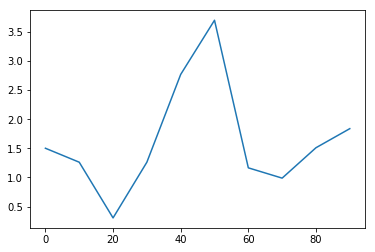
시리즈의 인덱스가 x축에 표시가 된다. use_index=False를 하면
인덱스가 건네지지 않는다. xticks, xlim 선택인자들을 이용해
조정을 할 수 있다.
대부분의 판다스 플롯팅 메소드들은 ax 매개변수를 선택인자로 갖고
있어서 matplotlib 객체들을 사용할 수 있게 한다. 이러한 것은 그리드
레이아웃에서 유연하게 판다스 그림들을 그릴 수 있게 한다.
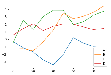
데이터프레임 각 열에 대해서 플롯을 하고 범례도 자동으로 단다.
In [11]:
df = pd.DataFrame(np.random.randn(10, 4).cumsum(0),
                  columns=['A', 'B', 'C', 'D'],
                  index=np.arange(0, 100, 10))
df.plot()
Out[11]:
<matplotlib.axes._subplots.AxesSubplot at 0x25c349e06d8>
plot은 다른 형태의 플롯에 대한 메소드들을 가지고 있다. 즉,
df.plot()은 df.plot.line()과 같은 것이다.
matplotlib에서 사용되는 키워드인자들을 사용할 수 있다.
다음은 Series.plot 메소드 인자들이다.
| Argument | Description |
|---|---|
| label | Label for plot legend |
| ax | matplotlib subplot object to plot on; if nothing passed, uses active matplotlib subplot |
| style | Style string, like ‘ko–’, to be passed to matplotlib |
| alpha | The plot fill opacity (from 0 to 1) |
| kind | Can be ‘area’, ‘bar’, ‘barh’, ‘density’, ‘hist’, ‘kde’, ‘line’, ‘pie’ |
| logy | Use logarithmic scaling on the y-axis |
| use_index | Use the object index for tick labels |
| rot | Rotation of tick labels (0 through 360) |
| xticks | Values to use for x-axis ticks |
| yticks | Values to use for y-axis ticks |
| xlim | x-axis limits (e.g., [0, 10]) |
| ylim | y-axis limits |
| grid | Display axis grid (on by default) |
데이터프레임은 각 열을 어떻게 플롯할 것인가에 대해서 선택할 수 있는 기능이 있다. 예를 들어 각 열을 하나의 축으로 그릴 것인가 각각 다른 축으로 그릴 것인가를 선택할 수 있다.
다음은 데이터프레임 플롯 관련된 인자들이다.
| Argument | Description |
|---|---|
| subplots | True/False. Plot each DataFrame column in a separate subplot |
| sharex | If subplots=True, share the same x-axis, linking ticks and limits |
| sharey | If subplots=True, share the same y-axis |
| figsize | Size of figure to create as tuple |
| title | Plot title as string |
| legend | Add a subplot legend (True by default) |
| sort_columns | Plot columns in alphabetical order; by default uses existing column order |
막대 그래프
plot.bar() 와 plot.barh()는 수직과 수평 막대그래프를 만든다.
이 경우 시리즈와 데이터프레임 인덱스는 x 또는 y 틱으로
사용되어진다.
In [12]:
fig, axes = plt.subplots(2, 1)

data = pd.Series(np.random.rand(16), index=list('abcdefghijklmnop'))

data.plot.bar(ax=axes[0], color='k', alpha=0.7)
data.plot.barh(ax=axes[1], color='k', alpha=0.7)
Out[12]:
<matplotlib.axes._subplots.AxesSubplot at 0x25c35c4ea20>
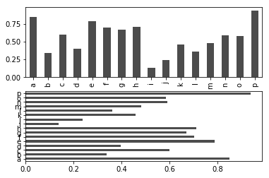
선택인자 color='k' 와 alpha=0.7는 막대그래프의 색깔과 투명도를
설정한다.
데이터프레임에서 열값들은 각 행에 대해서 나라히 하나의 그룹을 이룬다.
In [13]:
df = pd.DataFrame(np.random.rand(6, 4),
                  index=['one', 'two', 'three', 'four', 'five', 'six'],
                  columns=pd.Index(['A', 'B', 'C', 'D'], name='Genus'))
df
Out[13]:
| Genus | A | B | C | D |
|---|---|---|---|---|
| one | 0.057528 | 0.073144 | 0.300312 | 0.273924 |
| two | 0.067794 | 0.834821 | 0.486001 | 0.852875 |
| three | 0.643280 | 0.983068 | 0.795078 | 0.952532 |
| four | 0.789229 | 0.767178 | 0.772036 | 0.369599 |
| five | 0.894529 | 0.672706 | 0.128884 | 0.216806 |
| six | 0.135933 | 0.648354 | 0.646727 | 0.650689 |
In [14]:
df.plot.bar()
Out[14]:
<matplotlib.axes._subplots.AxesSubplot at 0x25c35f68860>
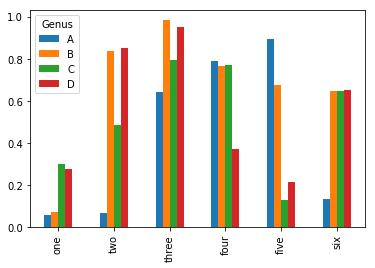
데이터프레임 열인덱스 이름 Genus가 범례의 제목이 되는 것을
주목하자.
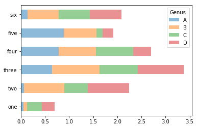
데이터프레임 막대그래프에서 stacked=True 선택 인자를 설정하면 값이
하나의 막대에 차례로 쌓이는 것을 볼 수 있다.
In [15]:
df.plot.barh(stacked=True, alpha=0.5)
Out[15]:
<matplotlib.axes._subplots.AxesSubplot at 0x25c36112b38>
Note
막대그래프의 유요한 사용법으로 시리즈 값들의 빈도수를 value_counts 메소들를 이용해서 나타내는 것이다. (value_counts().plot.bar())
앞에서 봤던 팁 자료에 대해서, 요일마다 파티 크기에 대한 백분율 막대그래프를 만들려고 한다고 하자. 먼저 `read_csv`를 이용해서 자료를 부르고 `crosstab`을 이용해서 요일과 파티 크기(파티 참여 인원)에 대한 표를 만들자. `crosstab`은 주어진 두 개(또는 그 이상)의 자료를 행열로 배열한 빈도수를 계산한다.
In [17]:
tips = pd.read_csv('data/tips.csv')

party_counts = pd.crosstab(tips['day'], tips['size'])

party_counts
Out[17]:
| size | 1 | 2 | 3 | 4 | 5 | 6 |
|---|---|---|---|---|---|---|
| day | ||||||
| Fri | 1 | 16 | 1 | 1 | 0 | 0 |
| Sat | 2 | 53 | 18 | 13 | 1 | 0 |
| Sun | 0 | 39 | 15 | 18 | 3 | 1 |
| Thur | 1 | 48 | 4 | 5 | 1 | 3 |
In [19]:
# 1명, 6명 파티는 제외한다.
party_counts = party_counts.loc[:, 2:5]
각 행의 합이 1이 되도록 정규화하고 플롯을 한다.
In [20]:
# 합이 1이 되도록 정규화
party_pcts = party_counts.div(party_counts.sum(1), axis=0)

party_pcts
Out[20]:
| size | 2 | 3 | 4 | 5 |
|---|---|---|---|---|
| day | ||||
| Fri | 0.888889 | 0.055556 | 0.055556 | 0.000000 |
| Sat | 0.623529 | 0.211765 | 0.152941 | 0.011765 |
| Sun | 0.520000 | 0.200000 | 0.240000 | 0.040000 |
| Thur | 0.827586 | 0.068966 | 0.086207 | 0.017241 |
In [21]:
party_pcts.plot.bar()
Out[21]:
<matplotlib.axes._subplots.AxesSubplot at 0x25c36459dd8>
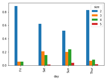
그림에서 보듯이 주말에 파티 크기가 증가하는 것을 알 수 있다.
플롯하기 전에 요약과 집계가 필요한 자료에 대해서는 seaborn 패키지가
훨씬 간단하게 사용할 수 있다. seaborn을 이용해서 요일별 팁
백분열을 살펴보자.
In [24]:
import seaborn as sns

tips['tip_pct'] = tips['tip'] / (tips['total_bill'] - tips['tip'])

tips.head()
Out[24]:
| total_bill | tip | smoker | day | time | size | tip_pct | |
|---|---|---|---|---|---|---|---|
| 0 | 16.99 | 1.01 | No | Sun | Dinner | 2 | 0.063204 |
| 1 | 10.34 | 1.66 | No | Sun | Dinner | 3 | 0.191244 |
| 2 | 21.01 | 3.50 | No | Sun | Dinner | 3 | 0.199886 |
| 3 | 23.68 | 3.31 | No | Sun | Dinner | 2 | 0.162494 |
| 4 | 24.59 | 3.61 | No | Sun | Dinner | 4 | 0.172069 |
In [23]:
sns.barplot(x='tip_pct', y='day', data=tips, orient='h')
Out[23]:
<matplotlib.axes._subplots.AxesSubplot at 0x25c36f014a8>
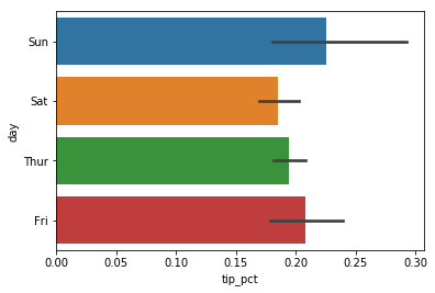
seaborn 에서 플롯 함수는 판다스 데이터프레임과 같은 데이터를 인자로
갖는다. 다른 인자들은 열이름들을 취한다. 요일별 여러 개의 관찰값들이
존재하므로 막대는 tip_pct의 평균을 취한다. 가운데 검은색 선은 95%
신뢰구간을 표현한 것이다.(이것은 선택할 수 있다.)
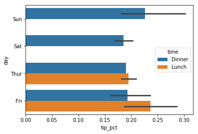
seaborn.barplot은 hue 인자가 있어서 또 다른 범주형 값에 대해서
표현할 수 있다.
In [25]:
sns.barplot(x='tip_pct', y='day', hue='time', data=tips, orient='h')
Out[25]:
<matplotlib.axes._subplots.AxesSubplot at 0x25c36f17358>
seaborn은 프롯에 대한 기본 설정을 갖고 있어서 플롯에 따라 색상
파레트, 배경색, 격자선 색등의 값들이 자동으로 설정이 된다.
seaborn.set을 이용해서 플롯 외형을 변경할 수 있다.
In [26]:
sns.set(style="whitegrid")
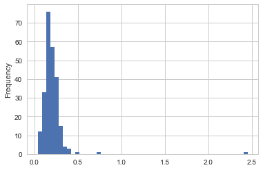
히스토그램 과 밀도그래프(Density Plots)
히스토그램은 값들의 빈도를 이산화 표시형식의 막대그래프의 일종이다.
자료들은 일정한 간격으로 나뉘어진 곳의 빈도수를 세서 막대그래프로
표시된다. 팁자료에서 전체 팁에 대한 팁 백분율을 시리즈 plot.hist
메소드를 이용해서 그릴 수 있다.
In [27]:
tips['tip_pct'].plot.hist(bins=50)
Out[27]:
<matplotlib.axes._subplots.AxesSubplot at 0x25c36f5e5f8>
히스토그램과 관련된 플롯으로 밀도그래프가 있다. 밀도그래프는 자료에
의해서 생성되는 연속 확률분포의 근사값을 계산해서 만든다. 일반적인
과정은 정규 분포와 같은 간단한 분포(커늘)들의 혼합된 형태의 분포를
근사해서 만든다. 따라서 밀도그래프는 커늘 밀도 근사(KDE) 플롯라고도
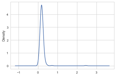
한다. plot.kde는 정규분포들의 혼합된 형태 플롯을 한다.
In [28]:
tips['tip_pct'].plot.density()
Out[28]:
<matplotlib.axes._subplots.AxesSubplot at 0x25c36fed630>
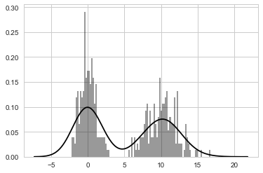
Seaborn은 distplot 메소드를 이용해 쉽게 히스토그램 및
밀도그래프를 동시에 그릴 수 있다. 예를 들어 두 개의 정규분포 자료로
구성된 자료로부터 이봉 분포를 그릴 수 있다.
In [29]:
comp1 = np.random.normal(0, 1, size=200)

comp2 = np.random.normal(10, 2, size=200)

values = pd.Series(np.concatenate([comp1, comp2]))

sns.distplot(values, bins=100, color='k')
Out[29]:
<matplotlib.axes._subplots.AxesSubplot at 0x25c380e73c8>
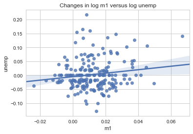
산점도 또는 점 플롯
점 또는 산점도 플롯은 두 개의 일차원 자료들의 연관성을 살펴볼 수 있는
유용한 플롯이다. 예를 들어, macrodata 자료로부터 몇 개의 변수들을
선택해서 로그 차이를 계산한다.
In [31]:
macro = pd.read_csv('data/macrodata.csv')

data = macro[['cpi', 'm1', 'tbilrate', 'unemp']]

trans_data = np.log(data).diff().dropna()

trans_data[-5:]
Out[31]:
| cpi | m1 | tbilrate | unemp | |
|---|---|---|---|---|
| 198 | -0.007904 | 0.045361 | -0.396881 | 0.105361 |
| 199 | -0.021979 | 0.066753 | -2.277267 | 0.139762 |
| 200 | 0.002340 | 0.010286 | 0.606136 | 0.160343 |
| 201 | 0.008419 | 0.037461 | -0.200671 | 0.127339 |
| 202 | 0.008894 | 0.012202 | -0.405465 | 0.042560 |
seaborn의 regplot 메소드를 이용해서 선형회귀선 및 산점도를
그릴 수 있다.
In [32]:
sns.regplot('m1', 'unemp', data=trans_data)

plt.title('Changes in log %s versus log %s' % ('m1', 'unemp'))
탐색적 자료 분석에서는 각 변수에 대한 산점도를 살펴보는 것은 많은 도움이
된다. 이러한 것을 쌍 플롯(pairs plot) 또는 산점도 플롯 배열(scatter plot
matrix)이라고 한다. seaborn은 밀도 그래프를 대각선에 위치시키는
산점도 배열 플롯을 함수를 제공한다.
In [33]:
sns.pairplot(trans_data, diag_kind='kde', plot_kws={'alpha': 0.2})
Out[33]:
<seaborn.axisgrid.PairGrid at 0x25c382ae588>
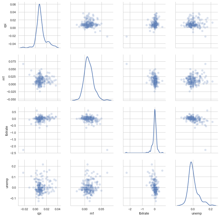
plot_kws 인자를 이용햇 키워드인자값들을 설정한다. 이 설정은 대각선
위의 성분에 대한 설정이 필요할 때 사용한다. 더 자세한 것은
seaborn.pairplot 문서를 찾아보길 바란다.
Facet Grids and Categorical Data
What about datasets where we have additional grouping dimensions? One way to visualize data with many categorical variables is to use a facet grid. Seaborn has a useful built-in function factorplot that simplifies making many kinds of faceted plots (see Figure 9-26 for the resulting plot):
In [34]:
sns.factorplot(x='day', y='tip_pct', hue='time', col='smoker', kind='bar', data=tips[tips.tip_pct < 1])
Out[34]:
<seaborn.axisgrid.FacetGrid at 0x25c388d0f60>
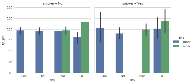
Figure 9-26. Tipping percentage by day/time/smoker Instead of grouping by ‘time’ by different bar colors within a facet, we can also expand the facet grid by adding one row per time value (Figure 9-27):
In [109]:
In [35]:
sns.factorplot(x='day', y='tip_pct', row='time',
   .....:                col='smoker',
   .....:                kind='bar', data=tips[tips.tip_pct < 1])
Out[35]:
<seaborn.axisgrid.FacetGrid at 0x25c38dc7048>
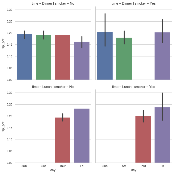
Figure 9-27. tip_pct by day; facet by time/smoker factorplot supports other plot types that may be useful depending on what you are trying to display. For example, box plots (which show the median, quartiles, and outliers) can be an effective visualization type (Figure 9-28):
In [36]:
sns.factorplot(x='tip_pct', y='day', kind='box',
   .....:                data=tips[tips.tip_pct < 0.5])
Out[36]:
<seaborn.axisgrid.FacetGrid at 0x25c34b5f2e8>
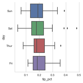
Figure 9-28. Box plot of tip_pct by day You can create your own facet grid plots using the more general seaborn.FacetGrid class. See the seaborn documentation for more.
그 밖의 파이썬 시각화 도구들
As is common with open source, there are a plethora of options for creating graphics in Python (too many to list). Since 2010, much development effort has been focused on creating interactive graphics for publication on the web. With tools like Bokeh and Plotly, it’s now possible to specify dynamic, interactive graphics in Python that are destined for a web browser.
For creating static graphics for print or web, I recommend defaulting to matplotlib and add-on libraries like pandas and seaborn for your needs. For other data visualization requirements, it may be useful to learn one of the other available tools out there. I encourage you to explore the ecosystem as it continues to involve and innovate into the future.